Refactor single post view: Difference between revisions
m (MrZYX moved page Refactor: Single Post View to Refactor single post view: naming policy) |
(+note) |
||
| Line 1: | Line 1: | ||
This is just a simple overview of the history of Diaspora's Single Post View, with the goal of engaging discussion on what direction best to take it. | This is just a simple overview of the history of Diaspora's Single Post View, with the goal of engaging discussion on what direction best to take it. | ||
{{Note|1=This page is about '''the history''' of the single post view, with '''old''' mockups. If you want to suggest and discuss changes to the current implementation, start a [https://discourse.diasporafoundation.org discussion on discourse].}} | |||
== Diaspora "Beta" == | == Diaspora "Beta" == | ||
Latest revision as of 07:21, 17 August 2017
This is just a simple overview of the history of Diaspora's Single Post View, with the goal of engaging discussion on what direction best to take it.
Diaspora "Beta"
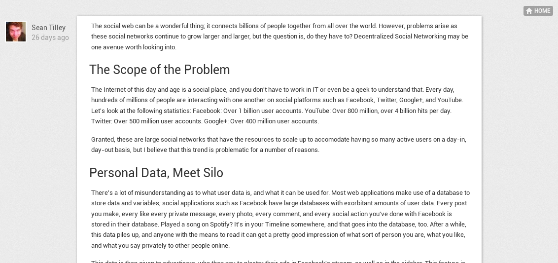
Diaspora's initial beta redesign by the core team was a bold attempt to make posts more content-centric, while simultaneously boosting discussion. At best, the reception was mixed; some users really liked it, while others complained that it took away from the readability and usefulness of posts.
Initial Refactoring
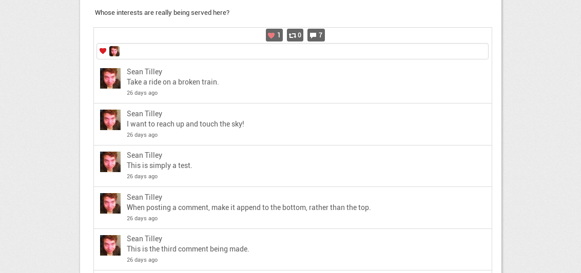
DeadSuperHero initially did some visual refactoring on the SPV, but parts of it still look alien to the rest of Diaspora's interface, and some things, such as oEmbeds that aren't videos, currently do not work in it. There are also bits of unused templates from the old SPV that still need to be removed. Another issue is that this refactor does not account for length of content, so on a lengthy post, a user would have to scroll all the way down to make a comment.
Alternate Proposal
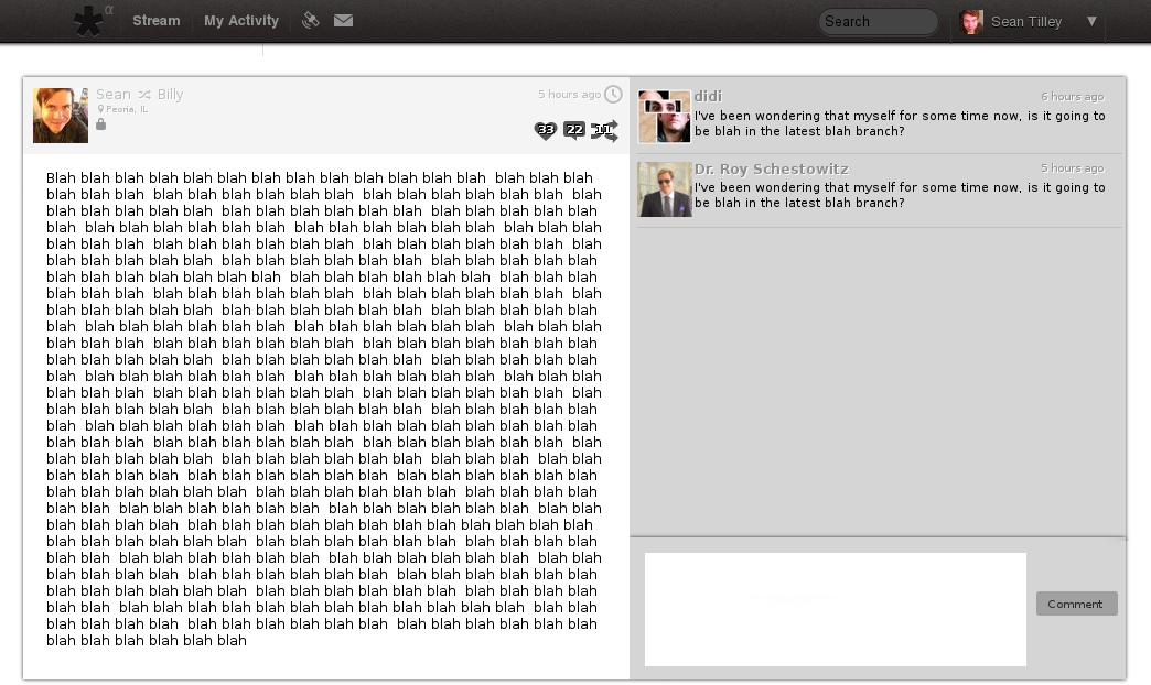
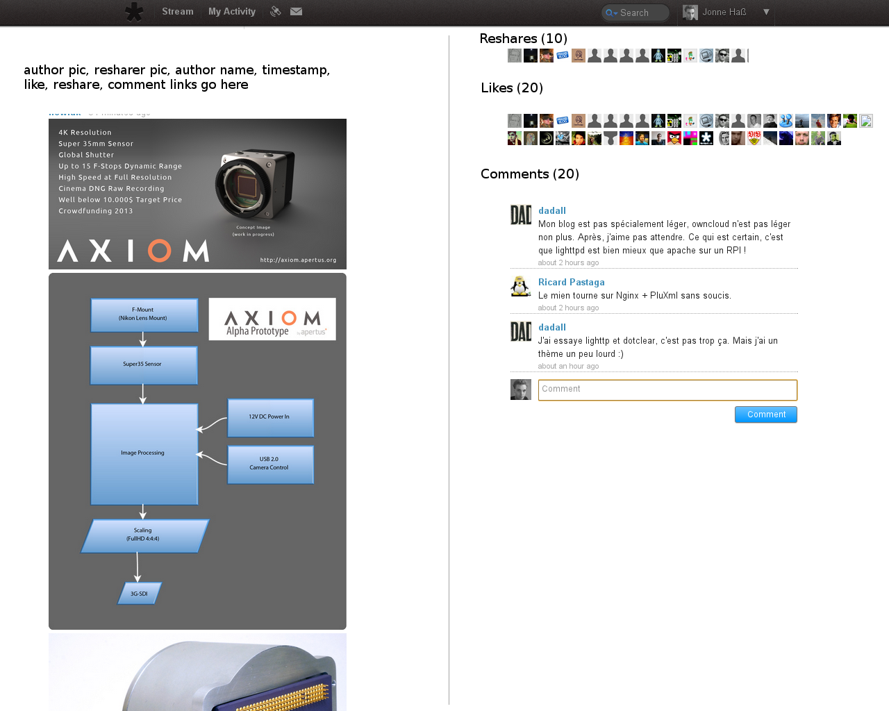
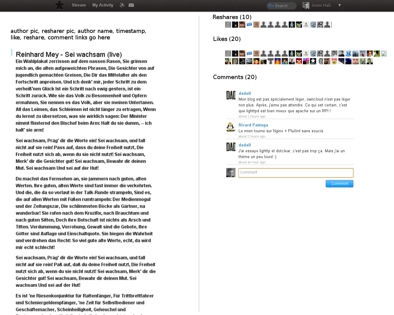
An initial comment from Mr ZYX proposed that perhaps a better course of action would be to replicate the functionality of Libertree's single post view, which has several benefits to it. Both the post and its comments have the capability of scrolling independently of one another, so as to require less scrolling overall from the user to read the original post and its subsequent comments.
For best appearance, please click on the picture below, as MediaWiki causes it to appear squashed when embedded in a wiki entry. Keep in mind that the styling, colors, elements, etc, are subject to change based on suggestions.
Some additional benefits to this UX are as follows:
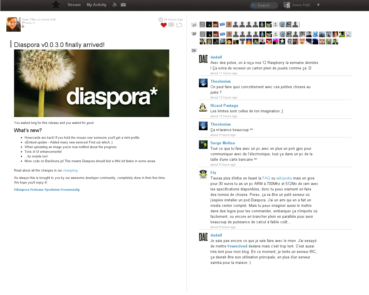
- If a user opts in to adding their location in a post, it appears in the header
- A lock icon appears to indicate that it is a limited post
- Because it could be put together using stream elements, the view could have support for all of the oEmbed providers supported currently in the stream.
- Adding a button for "liking" comments would be trivial in this UX, and the flow would largely be uninterreupted.
- The comment box always appears above the comments itself. This could remain in a fixed position until a user scrolls all the way to the bottom, meaning a user wouldn't have to scroll to make a comment. Additionally, there would be extra space at the bottom just for the comment box to sit in, so that no comments would ever be obstructed.
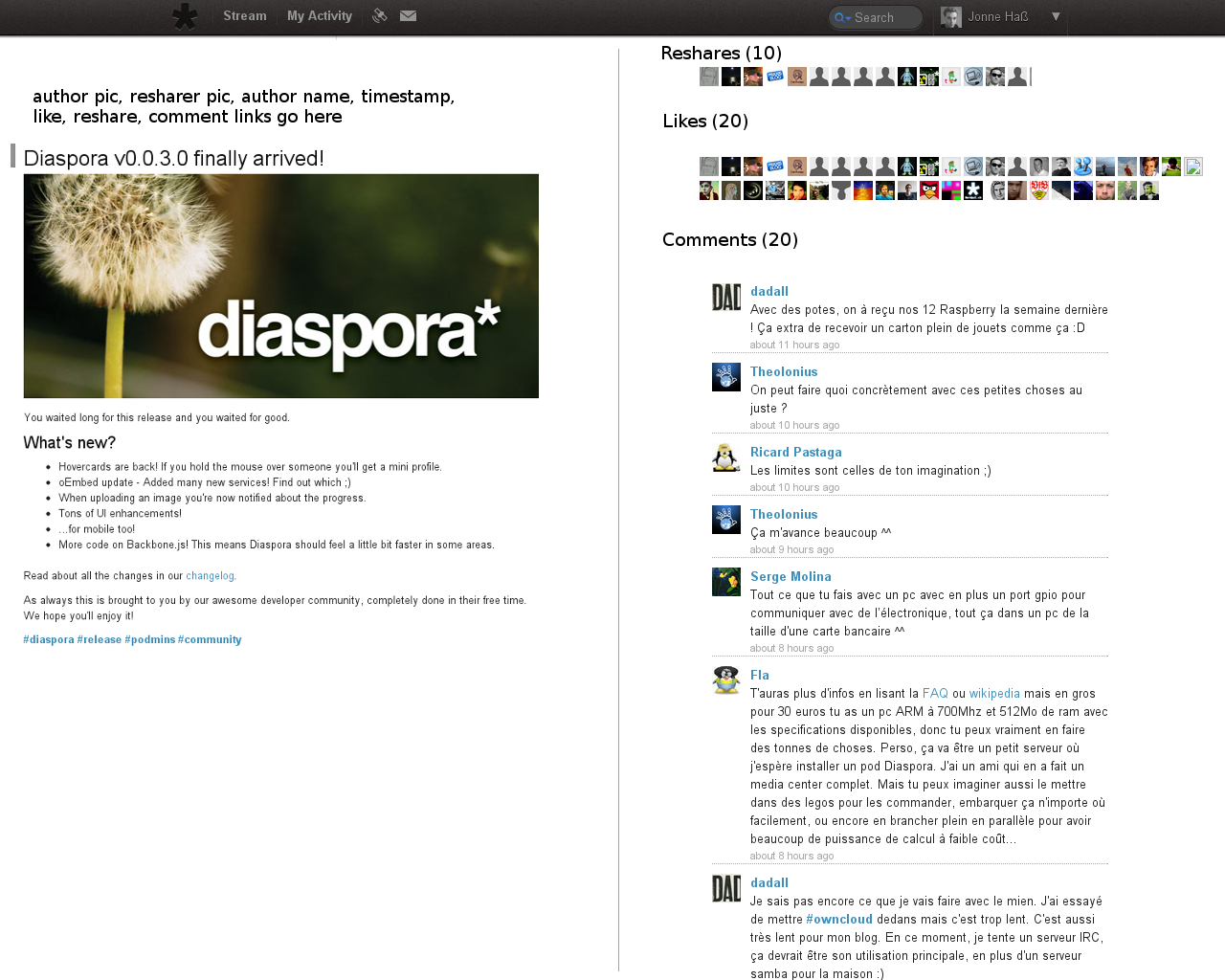
More mockups
Reconcilation of Designs
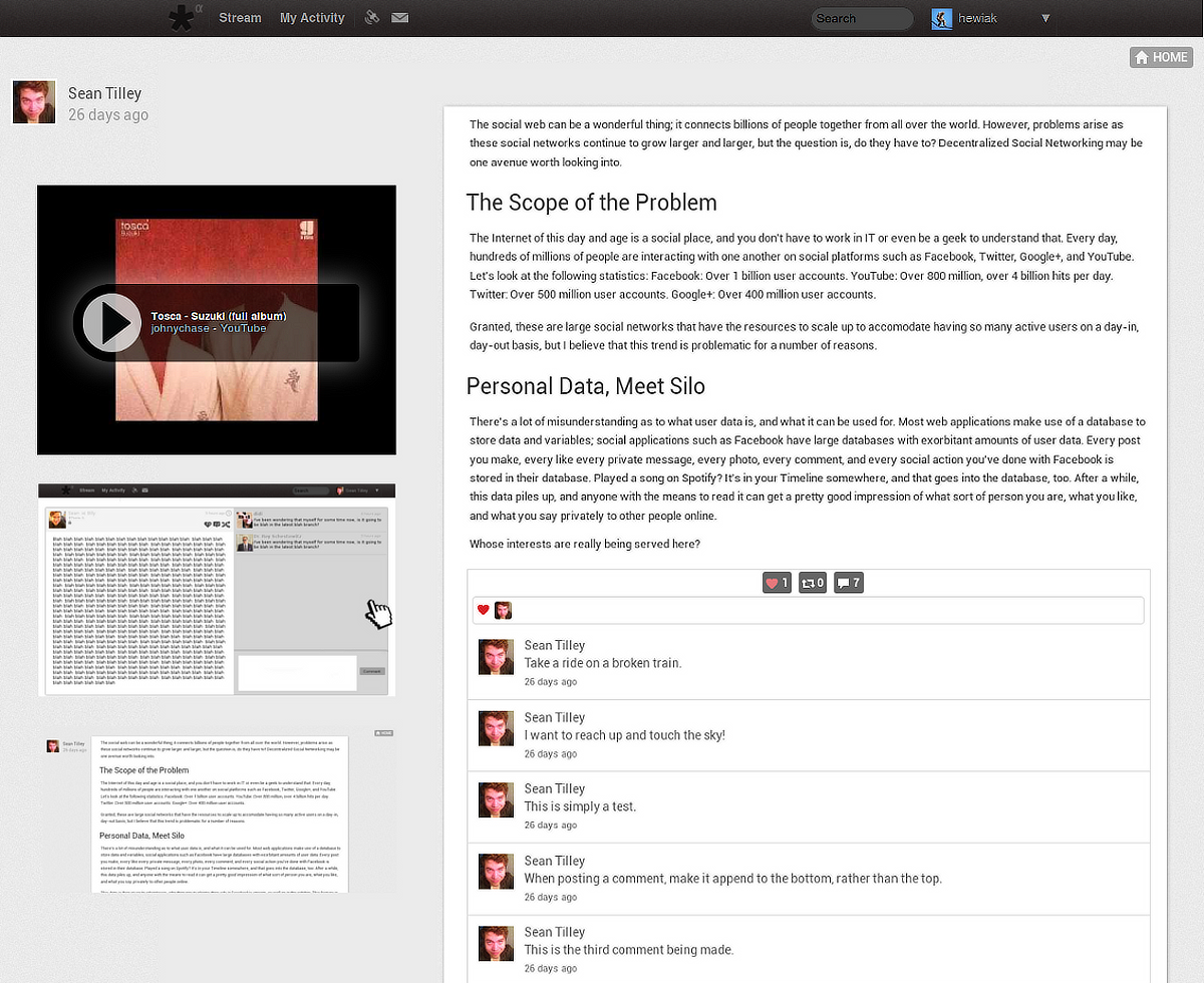
Here's an attempt to merge some of Jonne's ideas with the Libertree-like alternate proposal. I've stripped down a lot of the chrome to make it feel more "native" to the rest of Diaspora. (Keep in mind, the comments are intended to fill the space to align with the separators beneat each comment. I just didn't have the time to recreate a bunch of mock data in Gimp)
